
day
-1
one day at a time.
an app which focuses on one day at a time.
[Role]
UX + UI Designer
I
[Duration]
1 Month
I
[Type]
Personal Project
I
[Domain]
Wellness · Health
I
[Flows]
3 Complete
01
Project Overview
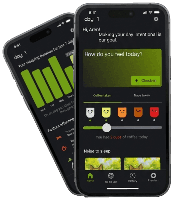
Day One isn't about fixing your entire life at once. It's about one day at a time. The idea was simple — people set big goals, get overwhelmed looking at the whole picture, and quit. So instead of building another all-in-one wellness app, I wanted to build something that just focuses on today. What can you do today? That's it. That's the whole thing.
02
Problem Statement
The original brief was a fitness app for budget-conscious users who couldn't afford a trainer or gym. But research changed everything.
As I moved forward with the research I realized, the actual struggle wasn't the workout itself. It was everything around it that made the goal of a fulfilling life impossible. Every existing product wasn't serving it.
Speaking of what I could conclude from the user interviews :
"They were asking for too much in just one app. So I had to zoom out, figure out what actually mattered, and break it down."
And the things I could conclude from the existing product :
Good apps cost money
Every wellness app worth using had a paywall students couldn't justify.
Diet charts ignored reality
No regional food, no budget logic, no recipe that fits what's actually in the kitchen.
One miss = full collapse
Skipping one day triggered guilt spirals and complete routine abandonment.
Plans felt generic
"Customizable" meant three preset options with different names.
03
Solution Statement
I realized at a point that people who hit the gym won't really care about an app. Honestly being a gym person myself, I realized Instagram, ChatGPT and many more platforms or rather tools have enough and more content to learn about workouts and diets. So building a product based on the initial idea was just a waste of time.
So I narrowed it down. Focusing just on sleep, dream body and daily habits(focusing to improve productivity) for the free tier. As people in general lag help in this areas.
The premium tier unlocks things that are genuinely harder to solve — mood swings, PCOD, thyroid issues — real health stuff that can't be fixed overnight and keeps people coming back. The AI chatbot gets smarter the longer you use it. In the background it's a fully running AI; in the foreground it just looks like an app that gets you. The premium tier creates genuine retention by solving problems users can't easily fix elsewhere — making the product valuable enough to pay for, without relying on dark patterns.
04
Process
Rather than defaulting to a standard framework, I built the process around what the research actually needed — mind mapping, design thinking, card sorting, site mapping, and IA to figure out structure before touching a single screen.
05
Weekly Timeline
WEEK 1
WEEK 2
WEEK 3
WEEK 4
Research + Discovery
User interviews with 18–25 demographic. Competitor audits across both fitness and sleep/habit categories. Gym app concept pivots to wellness. HMW questions drafted from interview patterns.
Define + Ideate
Amit persona assembled from interview data. Empathy map, affinity clustering, mind map. Three product pillars confirmed. IA scoped. Free vs premium logic decided with specific reasoning for each split.
Wireframe + Early Testing
Low-fi wireframes across all three flows — daily habits, insomnia, general sleep. First usability round with 3 participants. Diet branching moved earlier. Sleep condition split got its explanatory label.
Mid-Fi → Design System → High-Fi
Mid-fidelity applied across 10+ screens per flow. Color psychology research → design system finalized. High-fidelity across all three complete flows. Second usability round. Prototype linked and tested.
06
Qualitative & Quantitative Analysis
Qualitative (UX Insight)
Users
Inconsistent users → need retention loops
Sleep/mood sufferers → need tracking
Budget users → need free value
Overwhelmed achievers → need simplification
Core Strengths
Emotional + sleep tracking → strong differentiation
Coin system → decent motivation
“One day at a time” → reduces overwhelm
Weak Spots
Progress → shows data, not insights
AI → vague, undefined
Habit tracking → generic
Hypothetical funnel metrics — modeled on comparable app benchmarks, not live data (this was a personal project without a live user base)
Funnel
Signup → onboarding: ~55%
Day 1 → Day 7 retention: ~35% (big drop)
Premium conversion: ~4–8%
Engagement
DAU/MAU: ~35%
Session: 3–5 min
Task completion: ~50–65%
Weak Spots
High impact: Sleep + check-ins
Mid: Mood, coins
Weak: To-do, progress
07
Competitor Analysis
Here's the initial competitor research which was based on the gym idea. Later I did also look into mental health apps which gave me a clearer understanding of what works best. But the competitor analysis lies down here:

08
Empathy Map
Says & Does
Says he has huge goals of hitting all of them at once.
Tries to solve all problems at once but fails to follow the routine for a long time and be disciplined.
Thinks & Feels
Thinks everything is achievable all at once with dedication but waits for the right time (which is never coming).
Feels long-term goals can be achieved using shortcuts without actually having to face hardships.
Pain
New routines every time he fails in the old ones — lack of proper guidance.
Feels the continuous need to make things interesting but doesn't know how to.
Gain
Through Day One he will focus on 1 day at once and also not feel the FOMO of missing out.
We will not just help to build a better body but also help to build a better life which will coincide to one's personal need.
09
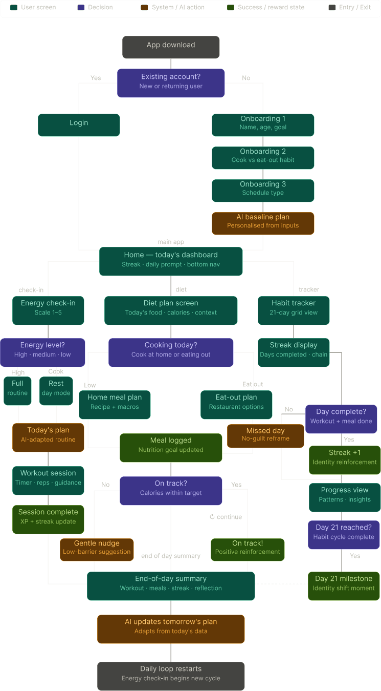
Information Architecture
10
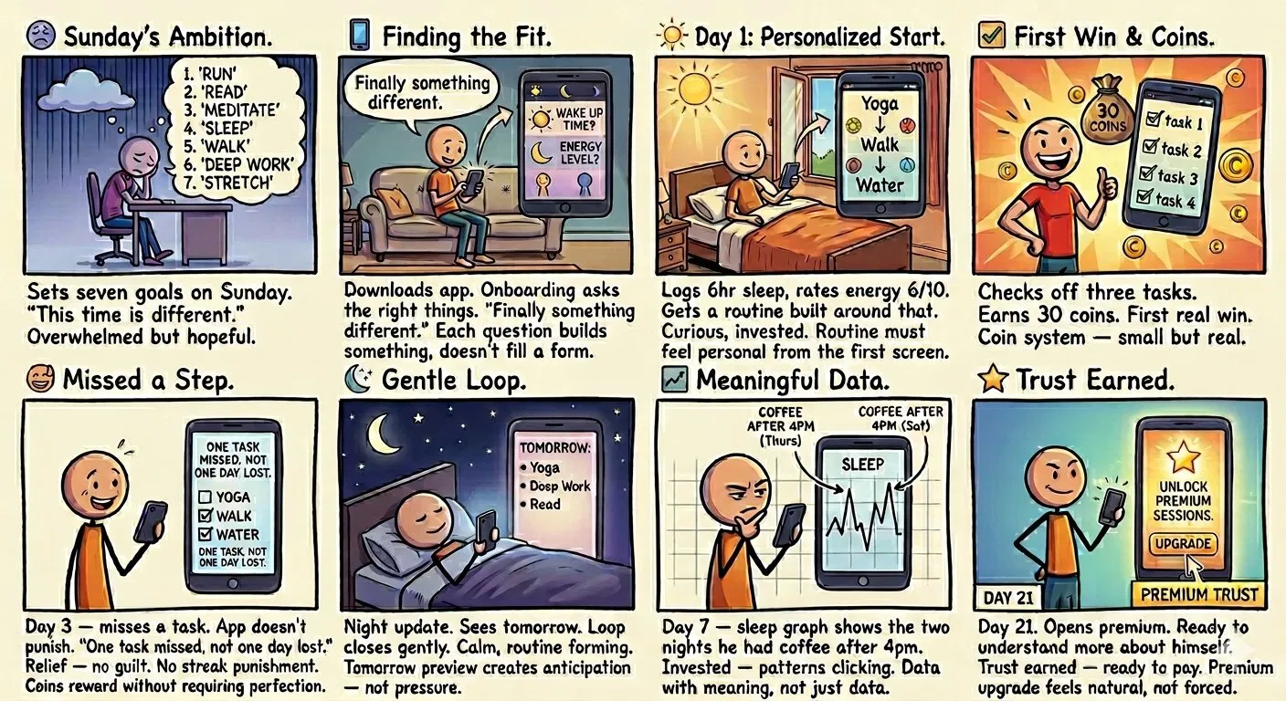
Story Boarding
11
User Journey


12
Persona

Name - Amit Bardhwan
Age - 21 years old/Male.
Occupation - Student with part-time job.
Location - India.
[Goal]
Goal
~ Customizable workout plans.
~ Customizable diet plans.
~ Reminders to help being consistent.
~ Sleep and mood tracker.
~ Progress tracker.
~ Actual charts showing progress.
[Frustrations]
Frustrations
~ Diet chart related issues as there is barely any diet charts he could find that would help him eating healthy fun.
~ Most good health apps are paid.
~ Lag of customization options.
~ He starts with enthusiasm but looses interest due to lag of motivation and guide and no proper progress tracker.
Most Available device - Phone mostly.
Motivation - Be happier and have a more fulfilling life.
13
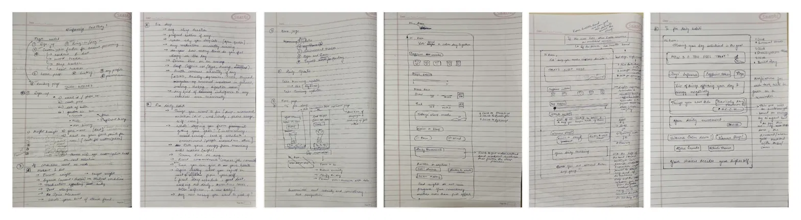
Low-Fi Wireframes
Starting on paper helped me focus on structure and flow before getting distracted by visuals.
14
Design System / Style Guide
Starting from zero is messy. So I started with color psychology — researching specific shades and using their impacts as a tool on people's mood. The colors used were listed below.
Background
Surface card
Primary
Primary Light
Alert
Info
Default Icon
Disable Icon
The logo was made with a specific vibe in mind, the idea was a modern logo which is something that's easy to remember and identify.

The type system used Inter throughout — H1 at 24px bold, H2 at 18px medium, body at 14px regular — keeping readability consistent across all three flows. Components were built as reusable Figma variants to maintain consistency at scale.
15
High-Fi Wireframes
The Figma file includes all three complete flows with working prototypes.
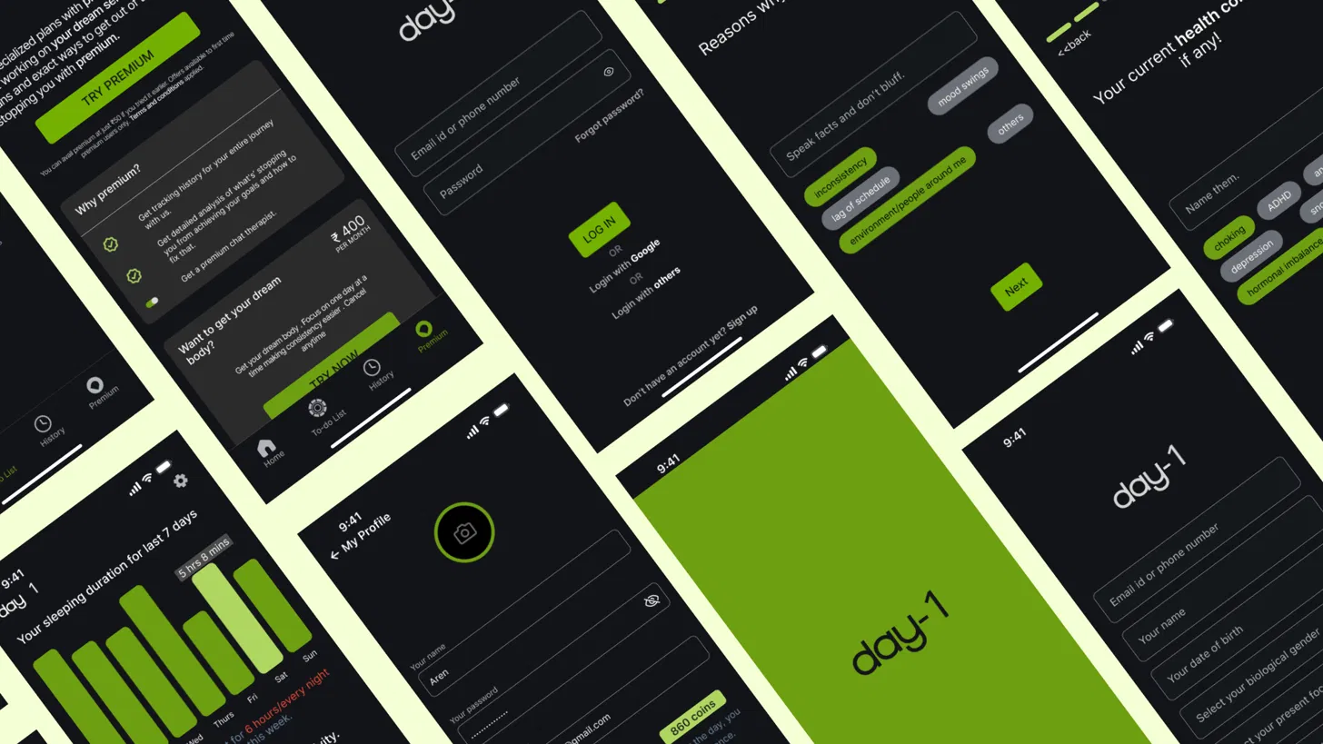
After 3 weeks of research, testing, and iteration — here's the final high-fidelity output across the core flows.
16
Usability Testing & Impact
Conducted 2 rounds of usability testing with target users from the 18–25 demographic
Identified and removed 2 onboarding friction points after Round 1 testing — task completion visibly improved in Round 2
Sleep flow received the strongest clarity feedback across all tested screens
Final prototype covers 3 complete flows across 10+ screens each
Product direction pivoted entirely based on research — from fitness to holistic wellness
17
Key Learning
The big realization
The gym app idea dying was the best thing that happened. Narrowing the problem made everything sharper — the design, the value prop, the monetization.
Research ≠ assumptions
What I thought people wanted and what they actually needed were different. The research changed the entire direction of the product.
Design with intent
Every color, every flow, every check-in screen had a reason behind it. Starting from zero is messy but it's the only way to avoid generic.
18
Thank You
4 weeks. Real research. Two rounds of testing. This isn't just a case study — it's proof of how I think. Thanks for reading — the full prototype is in the Figma link above.