
saathi
let's help you navigate.
an app that helps you navigate your new normal life.
[Role]
UX + UI Designer
I
[Duration]
3 Days
I
[Type]
Personal Project
I
[Domain]
Local Services
I
[Flows]
1 Complete

01
Project Overview
Saathi bridges the gap between consumers and local service providers — helping people who've moved to new cities get fair prices for home services without the language barrier, fake reviews, or cultural confusion that usually gets them scammed.
02
Problem Statement
The problem came from a real conversation with a senior who had recently relocated for work. Due to the communication gap, he was losing money and honestly barely surviving, trying to figure out how to save.
On finding this gap, I conducted 3 in-depth interviews with people who had recently relocated to new cities for work — a small but focused sample that gave clear, consistent signal.
Now, what I could conclude from the user interviews :
"They wanted something that could compare prices and give them the best offer at cheap rate moreover wanted an app that could help them navigate their locality."
This gap — language barrier, price confusion, and zero local knowledge — is where Saathi was born.
03
Solution Statement
Rather than building a marketplace from scratch — which would require massive supplier investment — Saathi takes a platform model: connecting users to existing local businesses and charging a small platform fee. This improves sales for local businesses while keeping costs low for users.
The loyalty mechanic was designed to solve the single biggest drop-off point — why would someone use Saathi twice instead of just calling the same person directly next time? The 4+1 model creates a tangible reason to keep booking through the platform. It also gives local businesses a predictable volume incentive to stay listed and offer their best prices.
04
Process
Since this was a 3-day sprint, I worked lean and fast. I defined the core user problem on Day 1, moved into low-fidelity structure on Day 2 using rapid sketching and reference gathering, and went straight to high-fidelity on Day 3. Every decision — navigation structure, loyalty mechanic placement, service card layout — came from the interview insights, not guesswork. Built as a rapid sprint to prove that strong research and smart decisions can produce a real product fast.
05
Weekly Timeline
DAY 1
DAY 2
DAY 3
User Interview
A brief in-person interview for three different people who just shifted for new life changes were taken.
Research + Wireframing
A summary of the previous day’s interview was made and persona was created along with competitor research, user interview summary and HMW questions. Then low-fidelity wireframes were sketched out covering the core booking flow and navigation structure.
Design System + High-fi screens + Prototyping
The design system was created and final screens were built along with prototyping.
06
Qualitative & Quantitative Analysis
Qualitative (UX Insight)
Users
Inconsistent users → need retention loops
Budget users → need free value
Overwhelmed achievers → need less stress
Core Strengths
Easier service navigation in locality → strong differentiation
One free service on four consistent paid services → decent motivation
Authentic reviews from real customers → reduces overwhelm
Weak Spots
Services → shows vague information
Budget → barely budget friendly
Thinking about consumer's convenience → generic
Hypothetical funnel metrics — modeled on comparable app benchmarks, not live data (this was a personal project without a live user base)
Funnel
Signup → onboarding: ~55%
Continuous 4 paid services → 1 free service earned: ~35% (big drop)
Engagement
DAU/MAU: ~35%
Task completion: ~50–65%
Weak Spots
High impact: Easy navigation + budget calculation
Mid: 5th service free
Weak: Too slow process
07
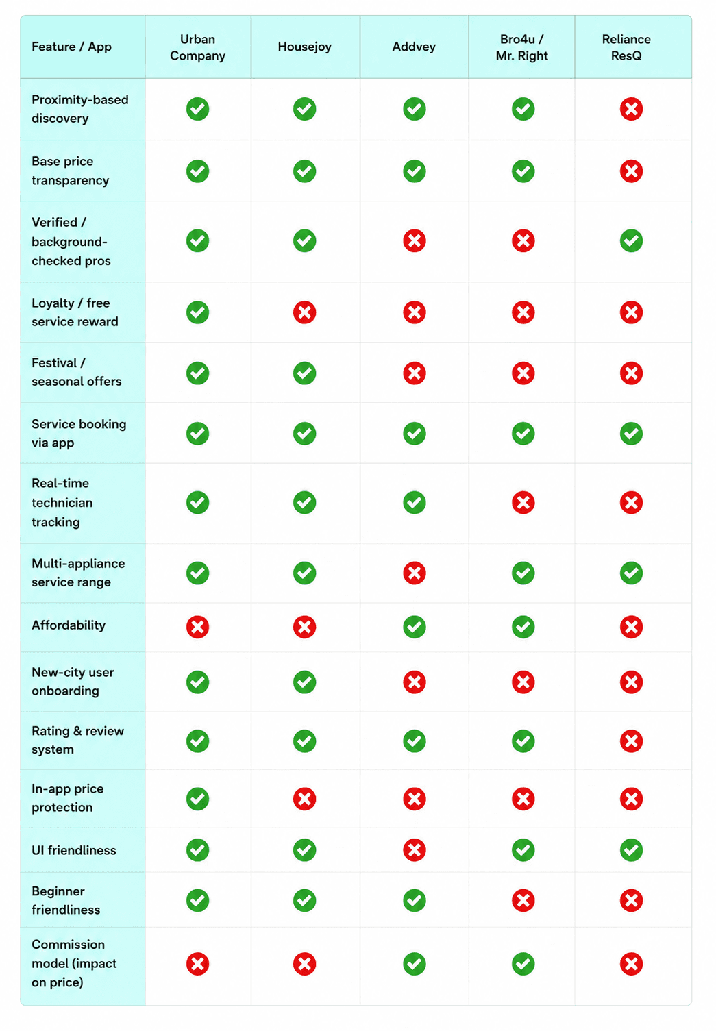
Competitor Analysis
Here's the competitor research:
08
Empathy Map
Says & Does
Says he will figure it out and make things easier for himself.
Uses the first service available and freaks out seeing the bill.
Thinks & Feels
Thinks he will figure everything out.
Feels depressed every time he gets overcharged for a simple service.
Pain
Language difference.
Getting charged more.
Gain
Through Saathi he gets the best deals at best prices.
Saves more money and gets less hassle and a more organized outcome.
09
Information Architecture

10
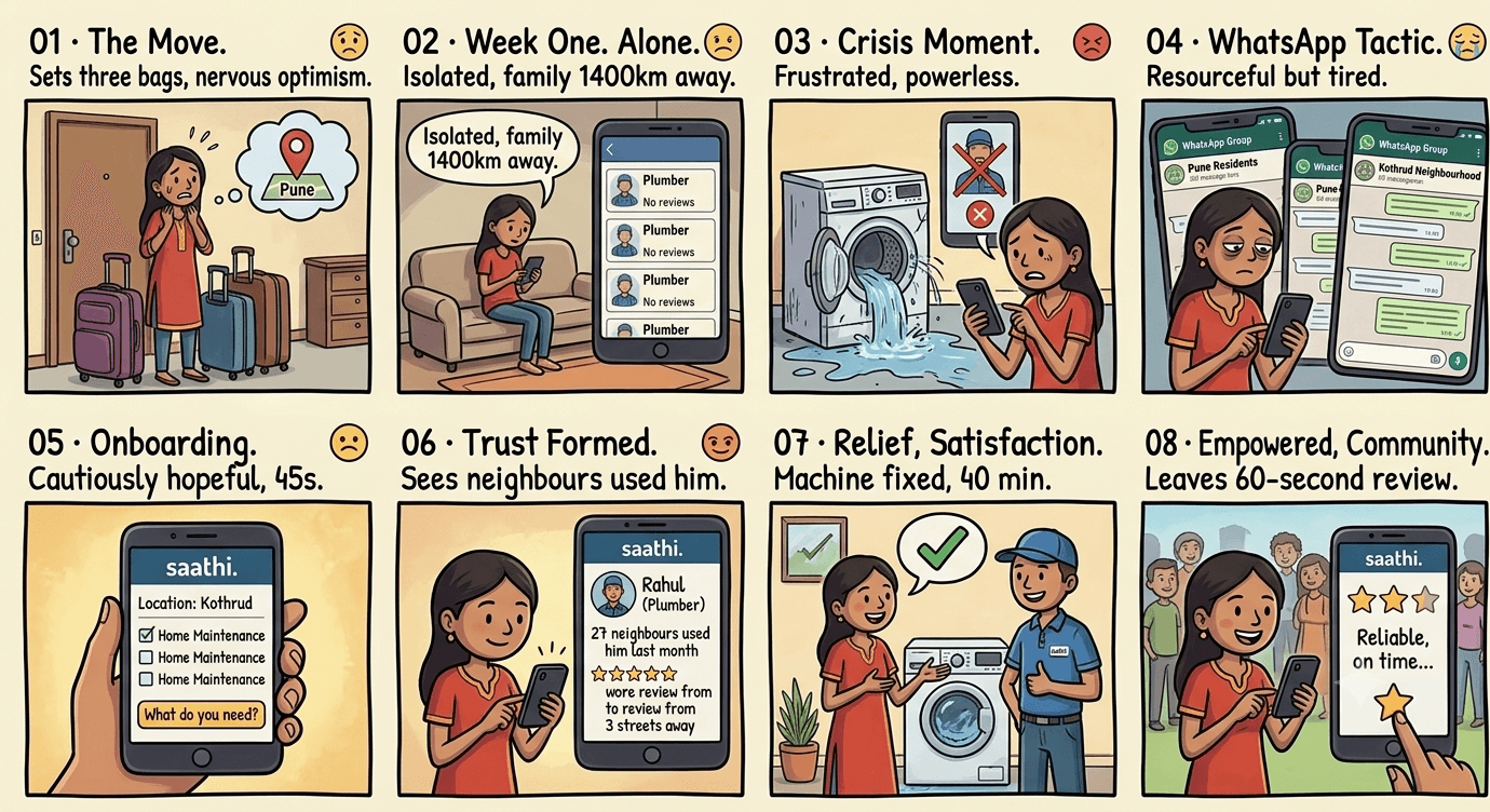
Storyboarding
11
User Journey
sign-in
sign-up
onboarding
home page
service info + latest offers
nearest service info + budget comparison
your loyalty info + service history +
how it works
gets account details
discover page
loyalty page
profile page
The core job-to-be-done: find and book a trusted local service in under 2 minutes, without needing to speak the local language or negotiate prices.
12
Persona

Name - Bibhan Chatterjee
Age - 25 years old/Male.
Occupation - Engineer.
Location - Bangalore, India.
[Goal]
Goal
~ wants less chaos after work.
~ wants to get home services at a cheap rate without much research.
[Frustrations]
Frustrations
~ people identify him as not a local and charge a lot for even basic services
~ language is a barrier.
~ finds it difficult to navigate his new locality.
~ got scammed a couple of times with fake ratings.
~ lack of clarity between what to expect and what he will actually get.
Most available device - Phone, mostly.
Motivation - Have fewer headaches after work related to home and not get scammed.
13
Low-Fi Wireframes
Given the 3-day constraint, I moved quickly from interview notes to structure — mapping the core flows before committing to any visual decisions.


14
Design System / Style Guide
I started with colors which make you feel safe and trusted.
Background
Info Card
Primary
festive offer
text
base card
info card
alert
The logo was made with a specific vibe in mind, the idea was a modern logo which is something that's easy to remember and identify.

The palette leans into trust and safety — blues and neutrals that feel reliable rather than flashy, which matters when you're asking someone to book a stranger into their home. Inter was used throughout for readability and consistency.
15
High-Fi Wireframes
The final screens were designed with Hick's Law front and centre — reducing the number of decisions a user has to make at each step. Service cards show price, rating, and distance in one glance. No hunting required.

16
Usability Testing & Impact
After completing the prototype I ran a quick walkthrough with 2 users from the original interview group. Both completed the core booking flow without prompting. Primary validation came from the original 3 interviews — the prototype was built directly from their stated needs.
17
Key Learning
Smart work over hard work
Building a real product in 3 days taught me that clarity of problem matters more than time spent. When you know exactly what you're solving, every decision gets faster.
Listen before you build
You don't need a groundbreaking idea to start. You just need to listen properly and find problems that genuinely affect people's daily lives.
Constraints sharpen decisions
A 3-day sprint taught me that strong constraints actually sharpen decision-making — every feature had to earn its place because there was no time to add things just in case.
18
Thank You
3 days. 3 interviews. 1 complete flow. Built to prove that good research and sharp decisions matter more than time. Thanks for reading — the full prototype is in the Figma link above.